10 Quick Fixes to Make Your Presentation Stand Out
Pivot East happened this week, and while I was very impressed with the delivery of the pitches, I found the slides could have used another round of review. So here it is… my list of the top 10 quick fixes for the decks I saw on stage this week. And to all startups out there making pitch presentations, these notes are for you too.
Content
This could be a whole ten step blog post on it’s own.. so I wanted to leave it out, but truth is, it’s the most important point. We’ve all shown up to the conference because we think you have something important to say. Please, don’t disappoint. Important information missing from several of the presentations at Pivot…
1) Revenue Model – how are you actually going to make money? What are the revenue streams?
2) Competition – by leaving it off the slides, I’m not going to think you’ve positioned yourself in an untapped market. I’m going to think you haven’t done your research and you have no idea who you’re going up against.
3) Customer Benefits – not features. Benefits! Features deliver on Benefits. I want to know why you’re customers are going to use your product.
4) Target Audience – What age? Gender? Purchasing power? Region? Touch points? Technology they use? Etc. Specifics matter.
Notice I didn’t mention press? Having coverage in the Standard, Human IPO, TechCabal, etc… that doesn’t impress me much. And it is definitely not important enough to steal time away from your limited seven minutes on stage. Prioritise content, and don’t forget points 1 to 4 listed above.
Branding
This one is so simple, yet it was the most consistent mistake made across all the presentations. Too many colours, fonts, shapes, and different designs were used. Look at your brand colours, logo, and UI… you’re presentation should aesthetically fall in line.
1) Limit the colours used. I recommend a text colour (grey or black), an accent colour, and a highlight / emphasize importance colour. Three should be enough to make your slide aesthetically interesting but still simple and clear. If you’re short on colours… use shades of the same three colours.
2) One font. Always. Remember, you can always change size, bold, or make lighter if you need to separate text and emphasise different points. Regardless, pick a brand font and stick to it. That goes for all your documents and official business material, not just this presentation.
Screenshots
Pivot East has a no demo rule. Thus, if you want to show the audience what your product looks like, screenshots are a great way to do so. But be careful with the shots you pick. And please, no more than one screenshot on a slide! I saw one presentation with three screenshots on one slide. As a result, I didn’t know what on the slide I was suppose to be looking at. I couldn’t see anything in detail as the screenshots were too small. And the presenter didn’t walk me through what to focus on. #Fail.
The important part here is that we see 1) your product is fully developed and working, and 2) the unique selling point or differentiator of the product. If you are a platform to support Merchant websites (think Shopify) than show me an example of one of your best merchant page. If you are a taxi app tailored for a developing market (think Uber for Kenya) than show me how my ride is priced, or the interactive zone map, or my integrated payment options. Those are the USPs for a taxi app in Kenya.
No Excel
Before Pivot East, I wouldn’t have thought to put this one on the list! This is a presentation of your most important points in seven min. Do you really need to show me a screenshot of your excel numbers? If you have important numbers to show me – call them out in bold on a simple plain slide. If you need the numbers to be in a chart, build one directly into your deck – do not screenshot an excel sheet.
Metrics
If you have important metrics, call them out in big and bold font. Don’t drown them out on the slide hidden in with a bunch of other text.
And please make sure your metrics are actually relevant. No Facebook Likes or Twitter Followers – those are vanity metrics. Don’t tell me the downloads on your mobile gaming app. Tell me the active users. Muva Studios was quick to highlight their 2.2 million downloads, but deliberately left off their active users – at 10,000. If you’re missing the key metrics, that either tells me you are hiding something, or you don’t know the important measurements of success on your business.
Photos
Real photos that you took yourself. No clipart. I repeat – NO CLIPART! A good presentation should be more photos than words. In fact, if you’re standing up in front of a crowd presenting with your deck, than the presentation should be ALL photos. Remember that saying – “a pictures is worth a thousand words”? Just think about how much more you could cover in those seven minutes if you used all pictures on your slides?

If you need to have numbers or text – lay them over the photos, or support the text with the photo. SokoText and Ubongo stood out from the rest because they used photos and minimal text. Not a surprise they were both category winners.
# of Words
Average reading speed of a person is between 200 to 300 words on a slide. As you want your audience to focus on you and what you’re saying, limit the number of words on your slide to under 40 total, thus guaranteeing your audience can read your slide and focus back on you in less than 15 seconds.
There is a big difference between a presentation deck that gets circulated via email, and one that’s presented in person. Make two different decks. Remember, when you’re presenting the deck – focus on pictures and use words only to call out the most important facts. Too many words will bore your audience and stop them from listening to all the important things you are saying.
This slide has way too many words and clipart! Oh no.
Team Information
If you include a team slide, please follow these two basic steps.
1) Use appropriate photos that clearly show faces. The photos you use need to be inline with your brand personality. If you’re a b2b corporate startup, use professional traditional head shots. If you’re a b2c social cupcake business, you can use photos of the team having fun in the kitchen. Just make sure the story the team photos tell are inline with your company image.
2) Talk about the relevant skills that make your team the BEST team to run your company. Names, university, and job title… great… but why them? What special interests, hidden talents, experience do they have to make me believe you have the best possible team executing your dream? Especially as an investor, we’re in the business of funding people. I might like your company, but if you can’t convince me you have the team to execute your idea, I’m going to pass. I need more than name, job title, and university. In fact, skip that info, just tell me why you hired them.
Alignment
I’ve corrected ALL my startups on this one – and it blows my mind that I have to. Aesthetics are important. Just like consistency with font and colours… consistency with alignment is a no brainer. It’s so simple, select your images and select align left, or centre, or right. There are tools to make this easy. Do it.
Wake up the crowd
Pivot East had five teams per category with five categories. Chances are you’re going to end up presenting to a crowd that’s half asleep. Especially if all the teams before you didn’t listen to the tips highlighted above. This is an opportunity for you to shine! Just make sure you wake up the crowd first. Clap your hands, stomp your feet, play a sound clip, play a quick video, start presenting from the back of the room, jump up and down, tell a joke, pull out a magic trick, just do something!
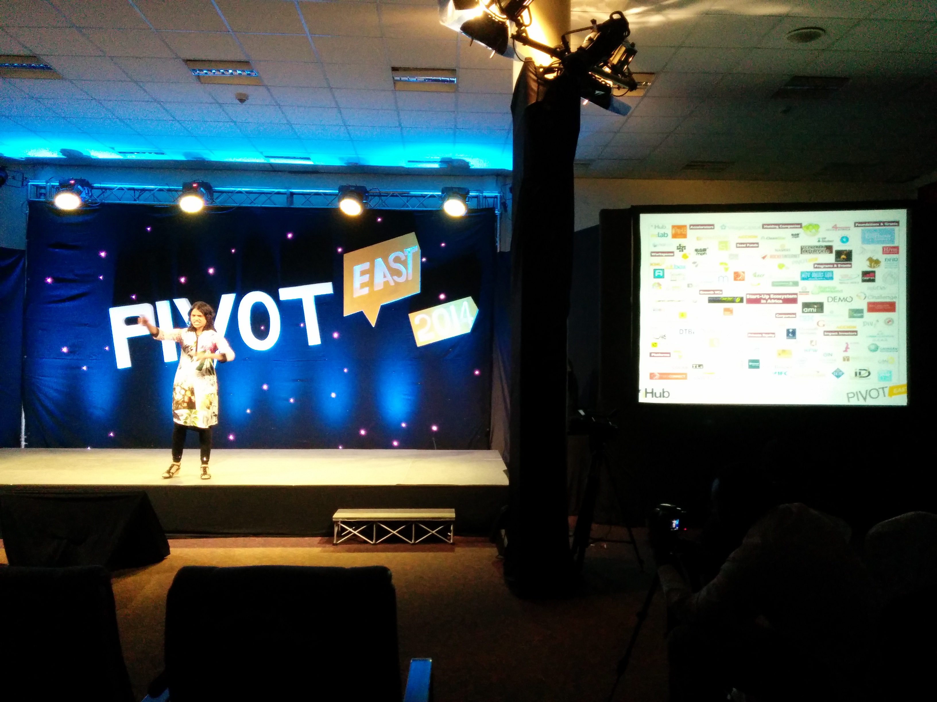
Jessica Colaco made an impromptu presentation at the end of Pivot East on the last day. Think about how tired the crowd must have been… but everyone was awake. Why? Bang bang boom! Pow Pow. She stomped her feet. She made loud pow pow sounds. She used photos on her slide. And she spoke with energy. Yes! Yes! Yes!
What I’ve listed above isn’t a lot. An hour or two extra on your slides taking out words, putting in photos, aligning the text and objects, changing the fonts and colours, and reviewing the content – and you’re presentation is going to stand out and grab the attention of your audience. Just make sure to wake up the audience first.
Good luck!